
One identity.
Different jobs to do.
A look at Missionwright’s own visual identity and the applications developed from it.
Recognizable, without making every encounter the same.

your mission.
Clarity in the words.
Recognition in the form.
The wordmark, typography and palette establish recognition. The composition changes with the task: introducing the business, explaining a recommendation or helping a team use a document.
Bricolage Grotesque provides the display voice. Public Sans supports reading. Ultramarine identifies, apricot adds emphasis, midnight carries text and white gives the information space.
A website with different jobs to do.
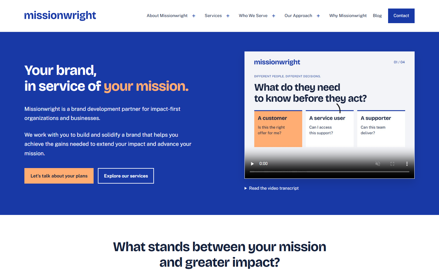
Recognition and understanding
The homepage introduces the partner and its purpose. Service pages explain what can be commissioned. Audience pages relate that work to the people making the decision.
Reading and action
Articles offer focused explanations. Each page has a clear route to relevant detail or a conversation about the work.
These identity elements belong to Missionwright. Their contribution depends on how each application uses them for its audience and purpose.
What would you like your brand to help you achieve?
Tell us about your organization, the work ahead and where you need a partner.
Let’s talk about your plans